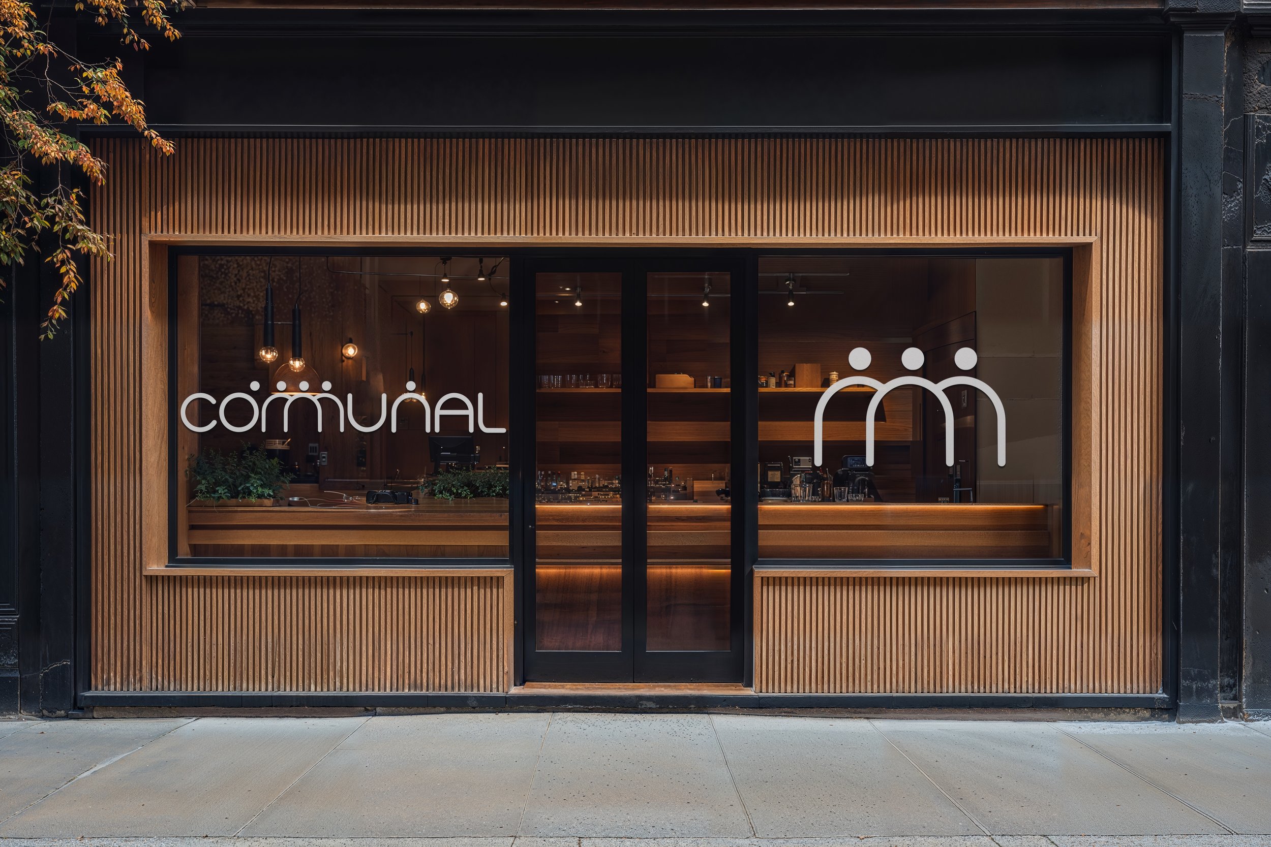
Communal Rebrand
Rebrand for a local provo restaurant called Communal. Part of their mission statement emphasizes, “We serve family-style and strive for that warm, happy feeling of a good meal enjoyed with friends.” I wanted something clean and modern in style but that would stand the test of time. I focused on simple lines and created a word mark where each letter was derived from the same circle, signifying unity and togetherness. For a little fun twist, I added additional circles that can be representative of the heads of people and designed the double M’s to be one combined symbol.


